Using stained glass to tell visual stories. If you’ve ever stood in front of a stained glass window and felt something — joy, calm, awe, nostalgia — you already know this: glass isn’t just about colour or craftsmanship. It’s about emotion.
What makes stained glass so compelling isn’t just how it looks. It’s how it feels. And that feeling comes from the magical trio of color, light, and mood — three forces that, when combined intentionally, turn your project into something more than the sum of its parts.
Let’s dive into how you can design glass art that doesn’t just shine — it speaks.
Why Colour in Glass Is So Powerful
Colour in glass is different from paint. It’s not something applied — it’s part of the material itself. Glass colour is fused into the structure of the glass, and that changes everything.
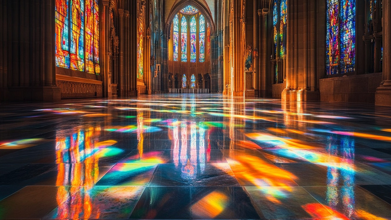
When light hits coloured glass, it doesn’t just reflect — it transmits. It becomes radiant. Alive. The effect can be soft and gentle or bold and dramatic. And even the same colour can feel wildly different depending on the time of day or lighting source.
This is why glass has such emotional power: the color literally glows from within.
Understanding Light as a Medium
Most artists treat light as a background condition. In stained glass, light is the medium.
That means you need to consider:
- Direction: Where will the piece be placed? Facing morning sun? Evening? Indoors with LED lighting?
- Type: Is the light source warm (yellow-toned), cool (blue-toned), or dynamic (sunlight)?
- Intensity: Bright, diffuse, or backlit?
A piece installed in a sunny kitchen window will behave completely differently than the same panel in a softly lit hallway.
Test your glass samples in light before committing to colours. You might be surprised — a pink glass that looks warm on your table may feel cold in north-facing daylight.
Colour Psychology in Glass Design
Colours carry cultural and emotional associations. These aren’t rules, but they are powerful design tools:
- Red: Passion, love, anger, energy
- Orange: Enthusiasm, creativity, warmth
- Yellow: Joy, optimism, caution
- Green: Growth, balance, nature
- Blue: Calm, trust, sadness
- Purple: Mystery, spirituality, luxury
- White: Purity, lightness, peace
- Black: Sophistication, mourning, depth
Use these associations to guide your colour palette when designing for a particular emotion. Want your piece to evoke a peaceful retreat? Lean into blues and greens. Want energy and warmth? Reach for orange, red, and yellow.
Mood Through Texture and Transparency
Emotion in glass isn’t just colour — it’s also texture and opacity.
Rippled or hammered glass adds movement and drama
Seedy glass (with small bubbles) evokes age and nostalgia
Opalescent glass softens harsh lines and diffuses light, creating a dreamlike feel
Cathedral (transparent) glass is clear and direct — full of light and contrast
Combining textures gives your work depth and emotional nuance. Try using opalescent glass for quiet moments in a design, and save your transparent pieces for areas where you want clarity and light to pour through.
Telling Stories Through Mood
You can create stained glass that doesn’t just show an image but tells a story — a mood or feeling embedded into glass. A few examples:
- “Winter Morning”: cool blue and white glass, gently textured, in a minimal landscape. Mood: peaceful, reflective.
- “Autumn Fire”: oranges, reds, warm streaky textures, irregular shapes. Mood: energy, nostalgia, warmth.
- “Grief and Hope”: dark muted tones at the base, brightening as the design rises. Mood: heaviness moving into light.
Glass lets you illustrate not just what something looks like, but how it feels.
Design Exercises to Explore Moods
Here are a few creative prompts to help you explore mood in your designs:
1. Monochrome Emotion
Pick one colour (e.g., blue) and create a piece using only shades and textures of that colour. Try to express an emotion — calm, sorrow, stillness — using only variations of tone and line.
2. Sound to Glass
Listen to a piece of instrumental music. Sketch a panel that interprets the feeling or rhythm of the sound using shape, flow, and colour.
3. Memory Panel
Think of a memory — a childhood moment, a place you loved, a dream. Choose colours that express how it felt, not how it looked.
4. Seasons of Emotion
Design four suncatchers or small panels inspired by spring (hope), summer (joy), fall (reflection), winter (stillness).
You’ll be surprised how expressive your work becomes when you begin from emotion first, rather than image or pattern.
Creating Contrast for Impact
Just like in storytelling, contrast creates drama and tension. Light/dark. Smooth/rough. Transparent/opaque. Warm/cool.
Want a joyful section to pop? Surround it with muted or darker tones. Want to emphasize calm? Build contrast with energetic sections elsewhere in the piece.
Intentional contrast makes mood changes visible and gives your work more emotional depth.
Light Over Time: Designing for Movement
Remember: light changes. A piece with a strong sunrise colour palette may glow brightly in the morning and look more subdued by afternoon.
Designing for changing light is one of the most sophisticated ways to deepen emotional expression. You can:
Use clear or colourless textures in places where light shifts dramatically
Create “quiet” spaces in the panel that absorb and soften light at different times
Layer transparent colours to create shifting hues based on time of day
Watch how your existing pieces behave in natural light — it’s the best teacher.
Real-World Example: “The Quiet Tree”
Image a panel called The Quiet Tree. It had a simple silhouette of a leafless tree, but the mood was everything.
It used:
Cool opalescent whites and icy blues in the background
A deep, streaky gray for the tree itself
Small bits of clear iridized glass that caught early morning light
In morning sun, it shimmered. At dusk, it became gentle and meditative. It captured that in-between mood: solitude, not sadness.
That was the first piece I encountered that felt like a poem — not just a picture. And it changed the way I thought about glass forever.
Feel First, Cut Second
Designing with emotion in glass is a different approach. Instead of starting with “what do I want this to look like?” ask: “What do I want someone to feel when they see this?”
Let that guide your glass selection, your shapes, textures, your colours. And don’t be afraid to experiment. Some of the most interesting pieces are born from play — not planning.
Because in the end, glass is frozen light. And light has the power to move people. So go ahead. Make something that glows with feeling.
Make something that’s more than beautiful — make something that stirs an emotive response – and don’t try to pleas everyone – some will love it and others wont.